Let's make something together.
Download Resume ↓Designed & Coded with Claude
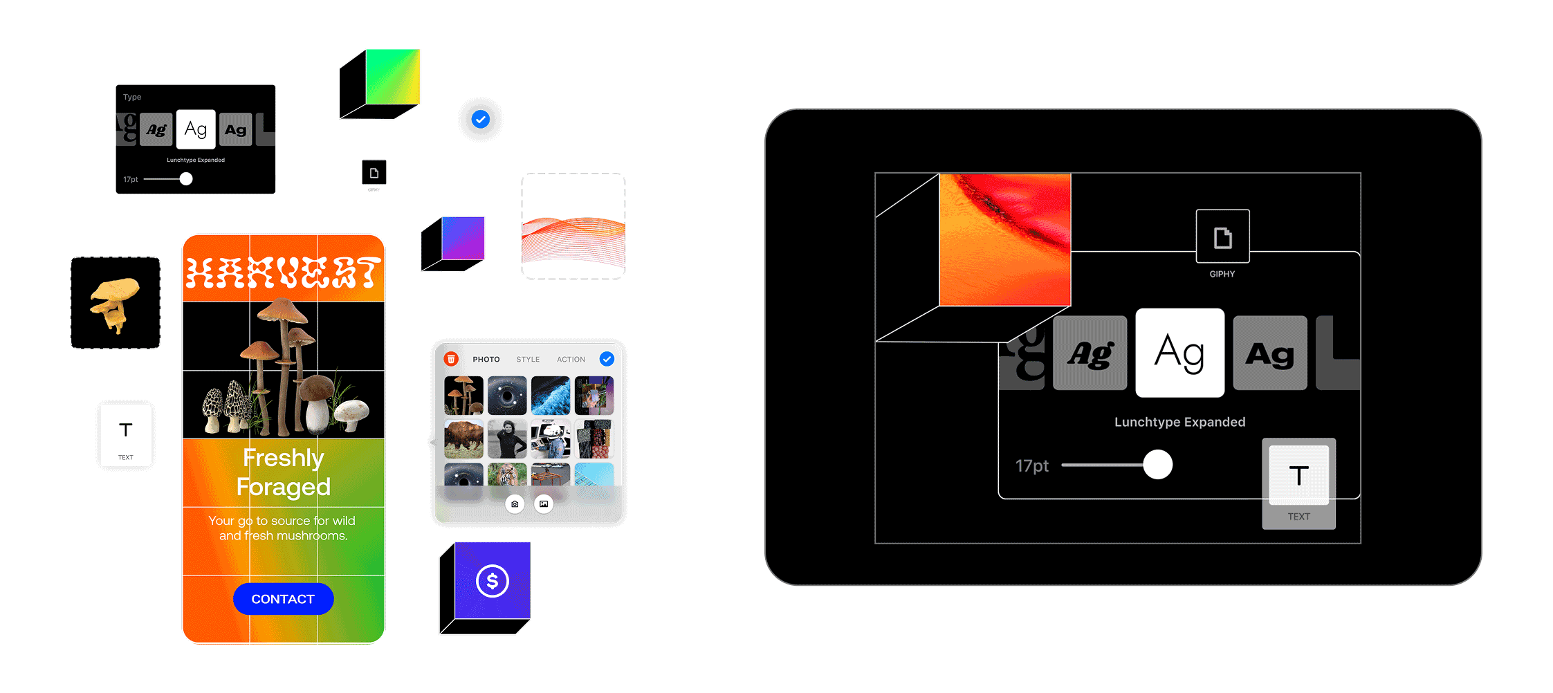
Working conversationally with an AI assistant, I directed every design decision: the ambient-light background motion, frosted-glass project cards, playful micro-interactions, and pixel-perfect adjustments. I learned to translate visual intent into technical requests, debug issues (from video autoplay to DNS), and iterate rapidly, treating the AI like a junior developer I was art-directing.
Built with HTML, CSS, and JavaScript, hosted on Vercel.

Designed & Coded with Claude
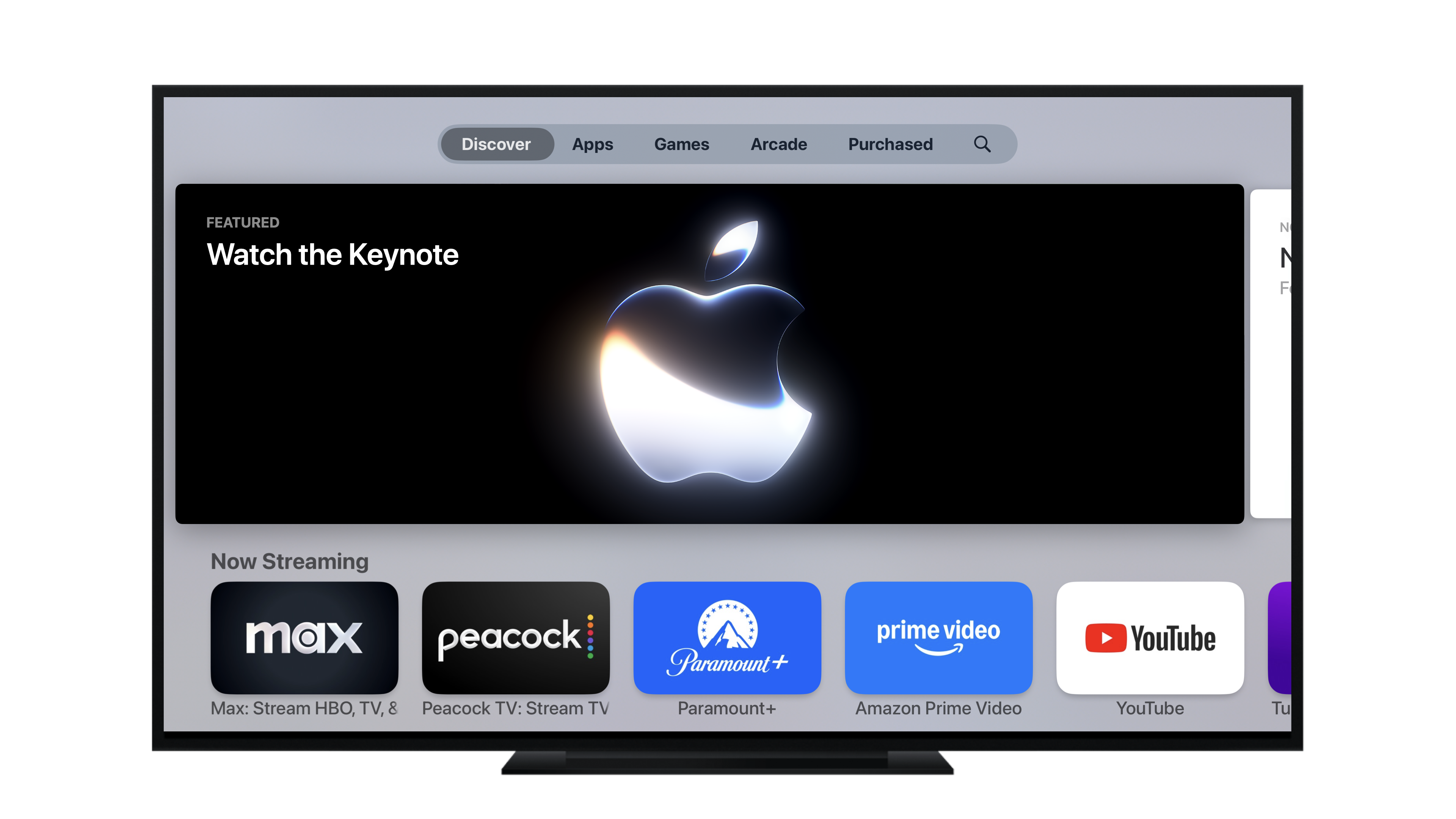
My team and I have been struggling with Apple TV content testing for years. With the help of AI, I was able to build an easy drag-and-drop testing tool that not only helps designers test the accuracy of the art, but also allows one-click download for any presentation purposes.


Art Direction | Communication
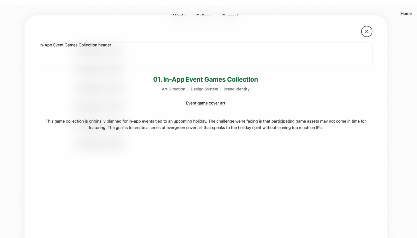
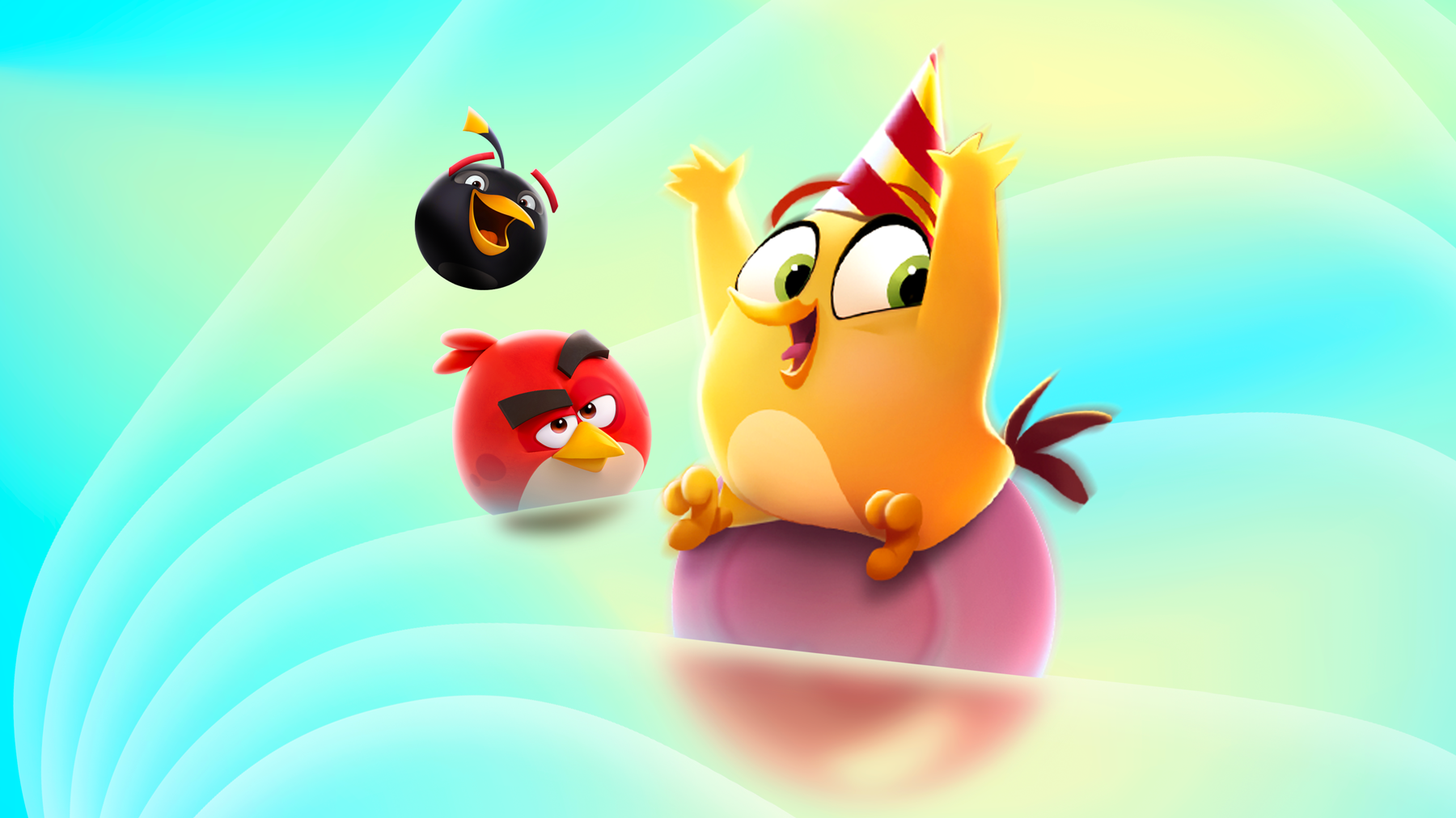
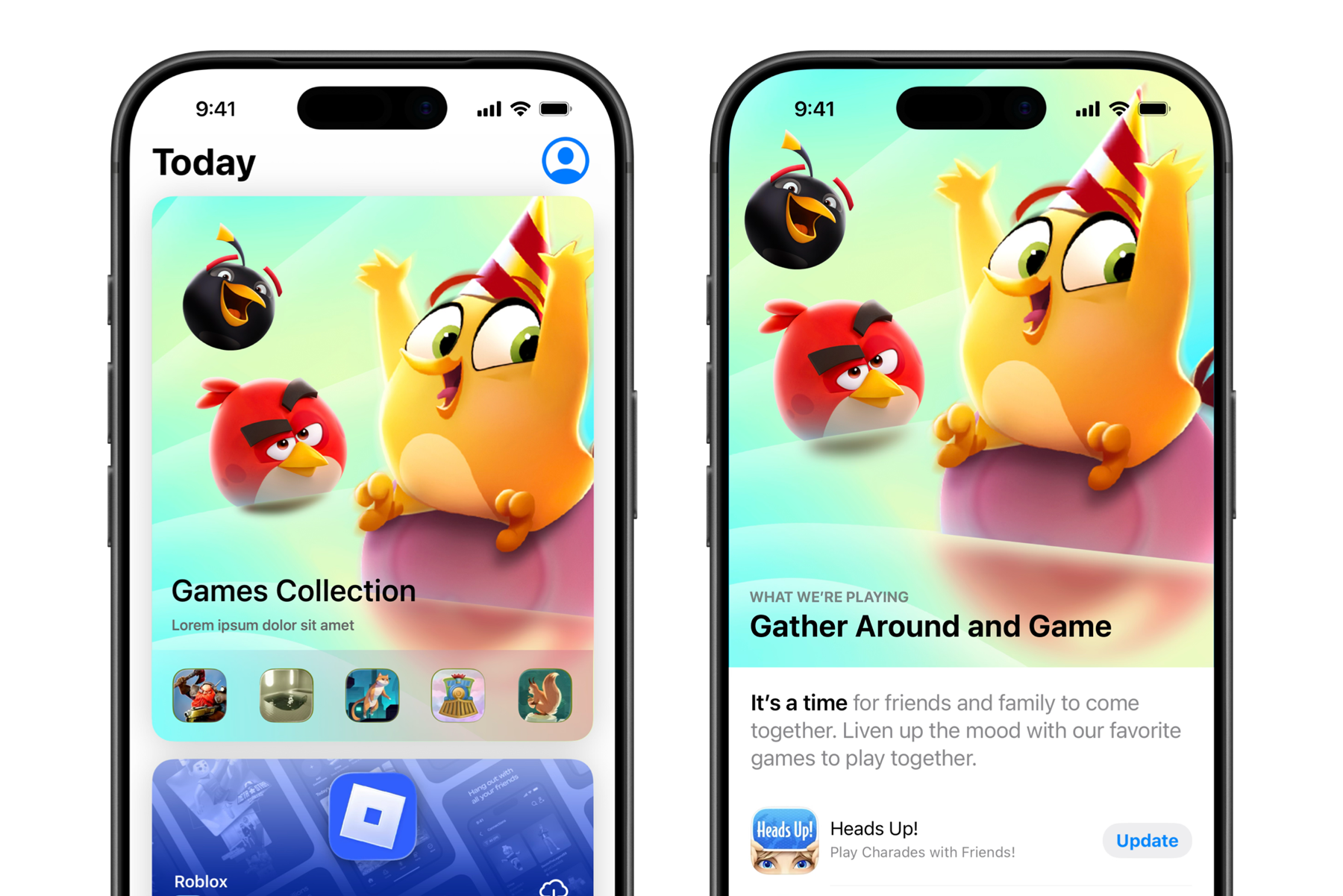
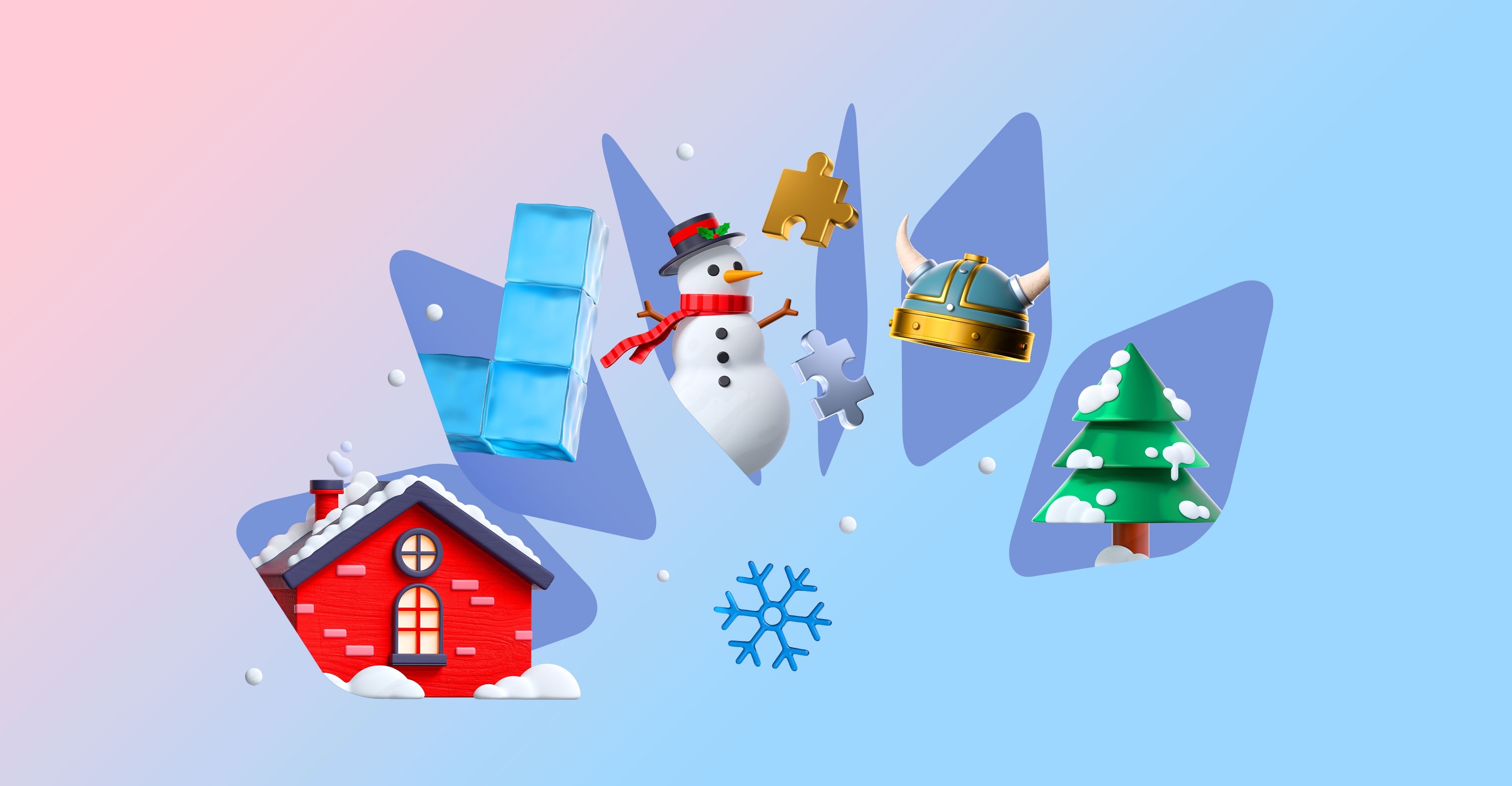
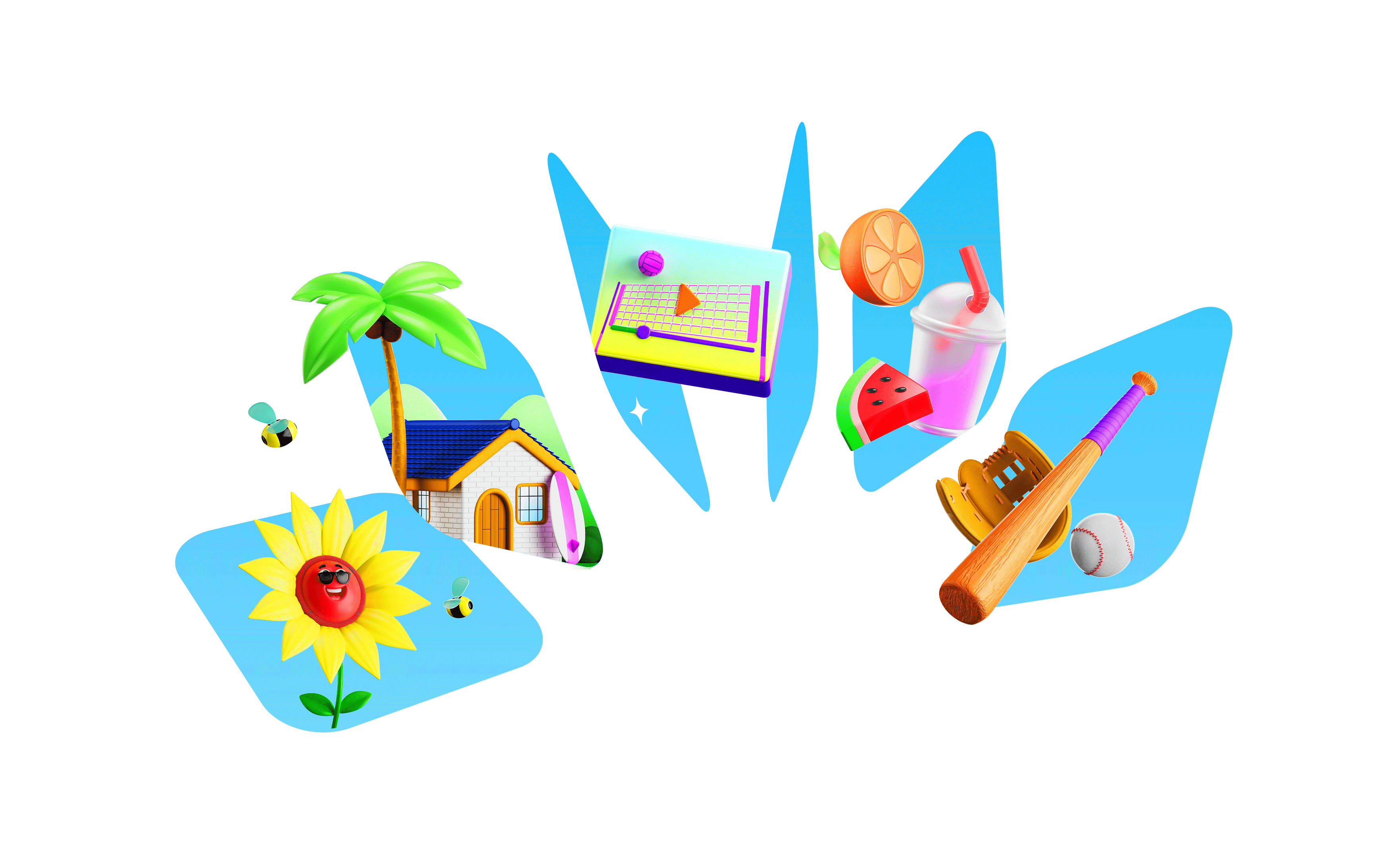
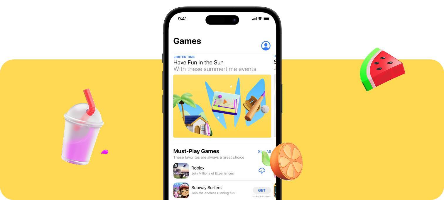
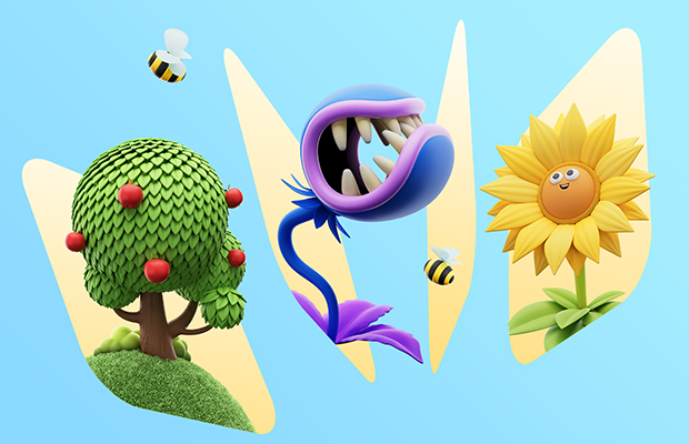
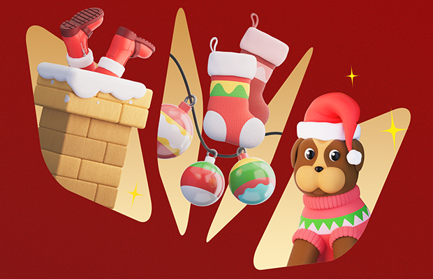
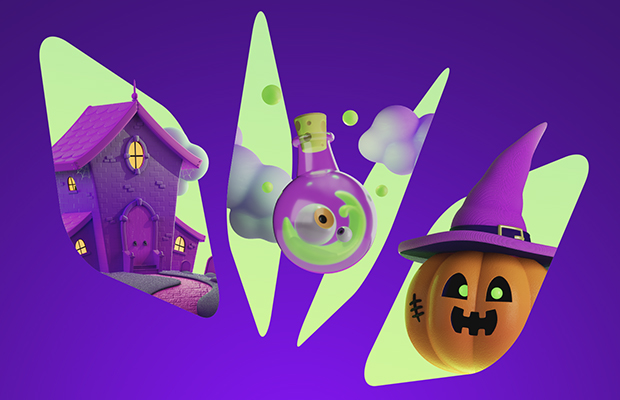
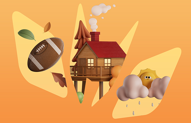
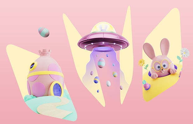
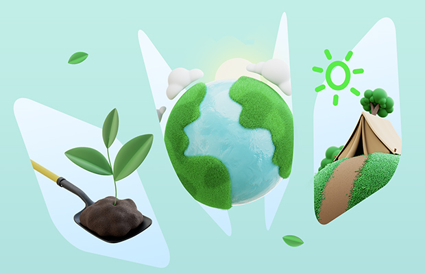
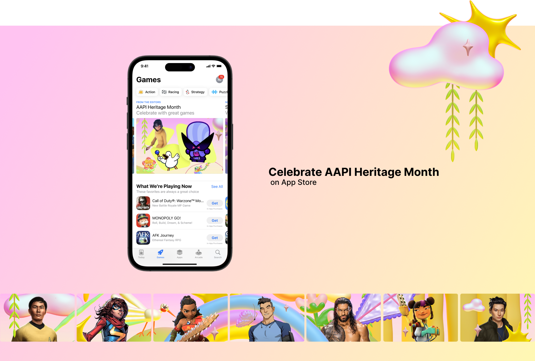
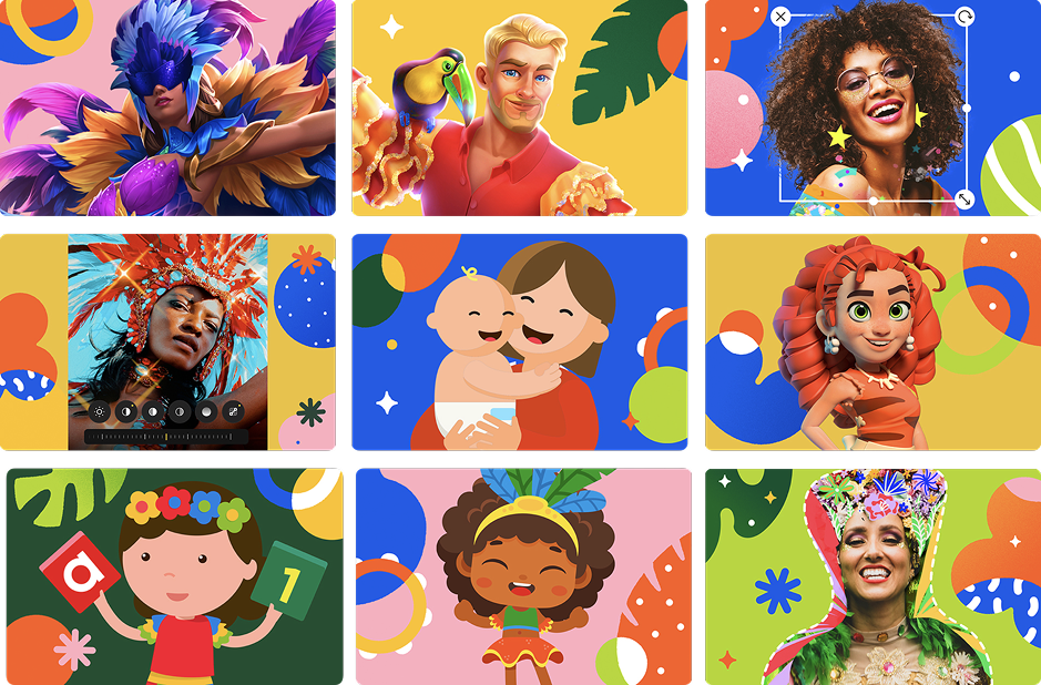
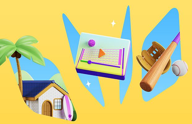
Originally planned for in-app events tied to an upcoming holiday, the challenge was to create cover art that felt festive and relevant—yet remained evergreen and not overly dependent on specific IP.
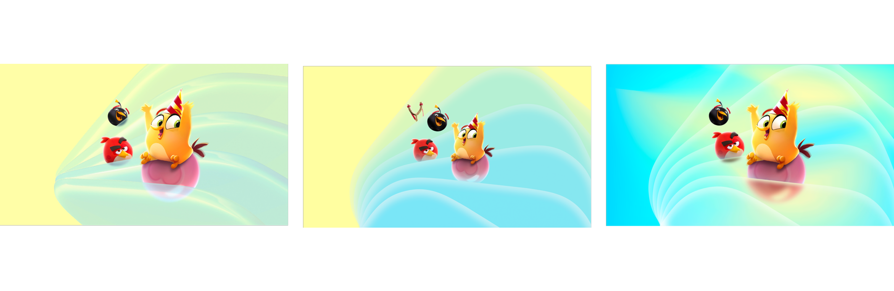
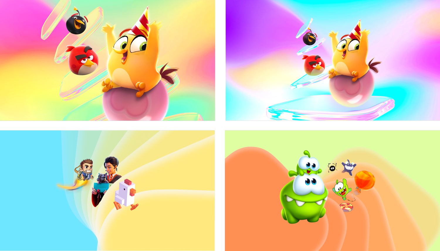
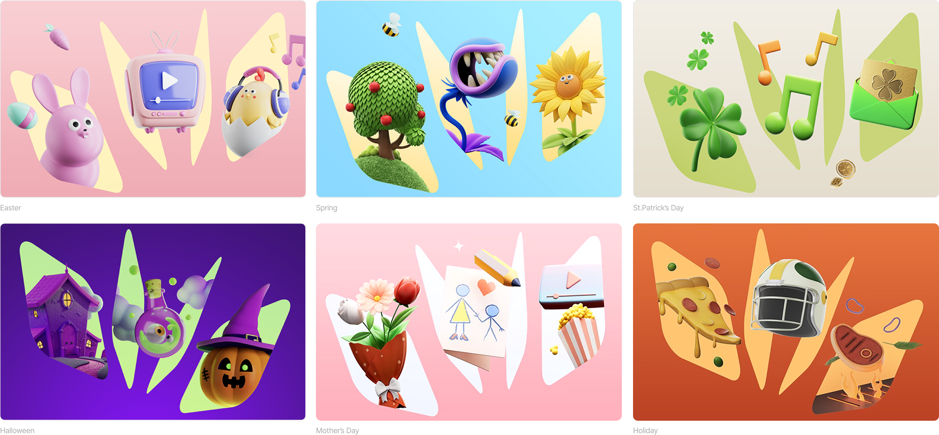
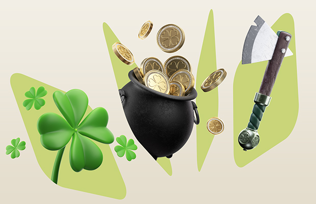
To address this, I focused on capturing the essence of the holiday through stylized, versatile design. I explored a range of visual directions and collaborated closely with a 3D artist to build a library of playful, thematic objects that could be repurposed across future campaigns. The result is a set of adaptable, eye-catching assets that balance seasonal relevance with long-term usability.
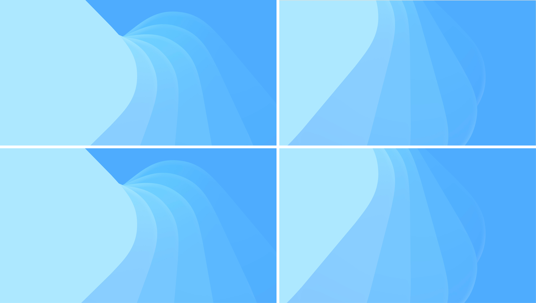
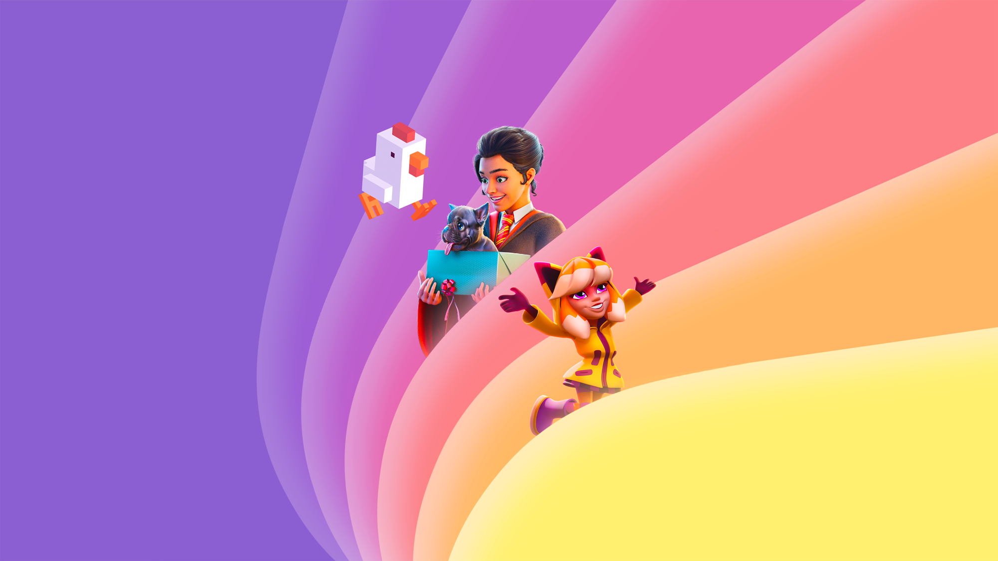
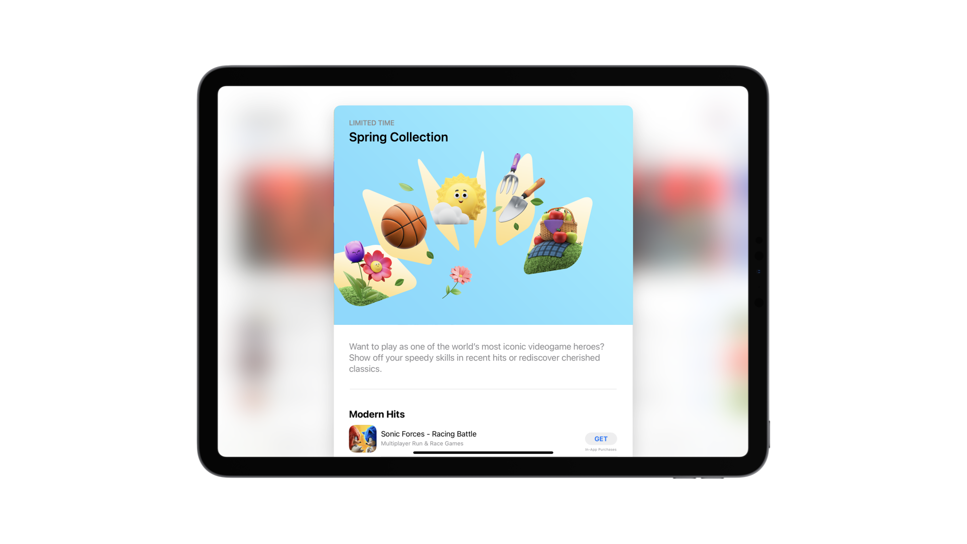
The chiclet fan structure mimics the motion of a deck of cards being shuffled. It brings a dynamic, energetic feel that plays into the idea of something exciting unfolding in the moment—capturing the idea of an in-app event that is "happening now."

Visual System | Design Component
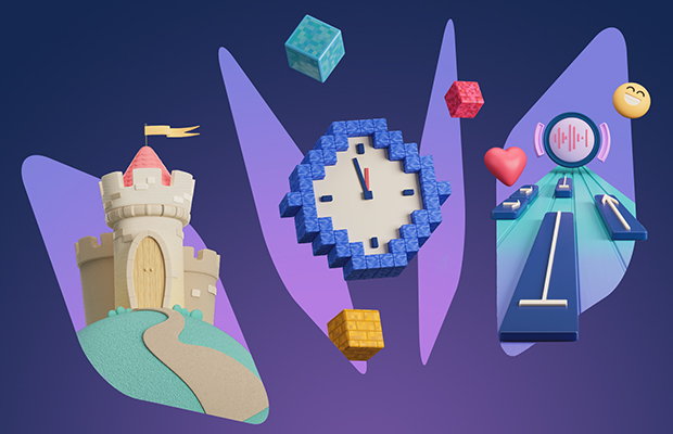
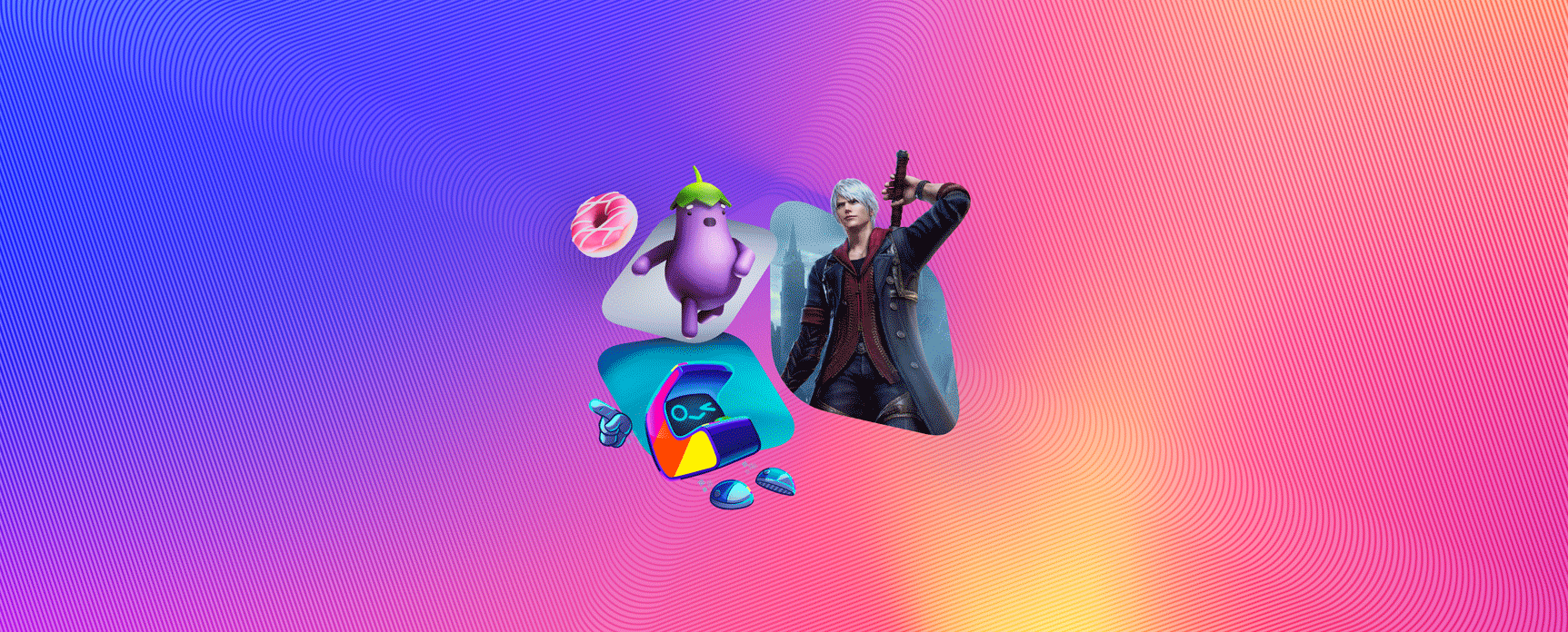
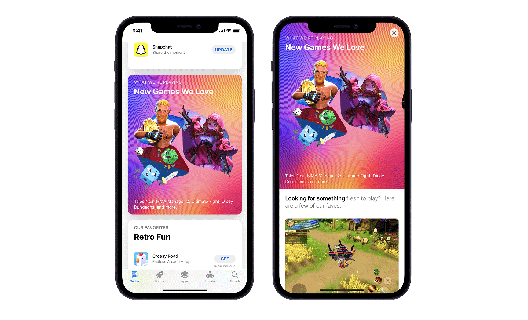
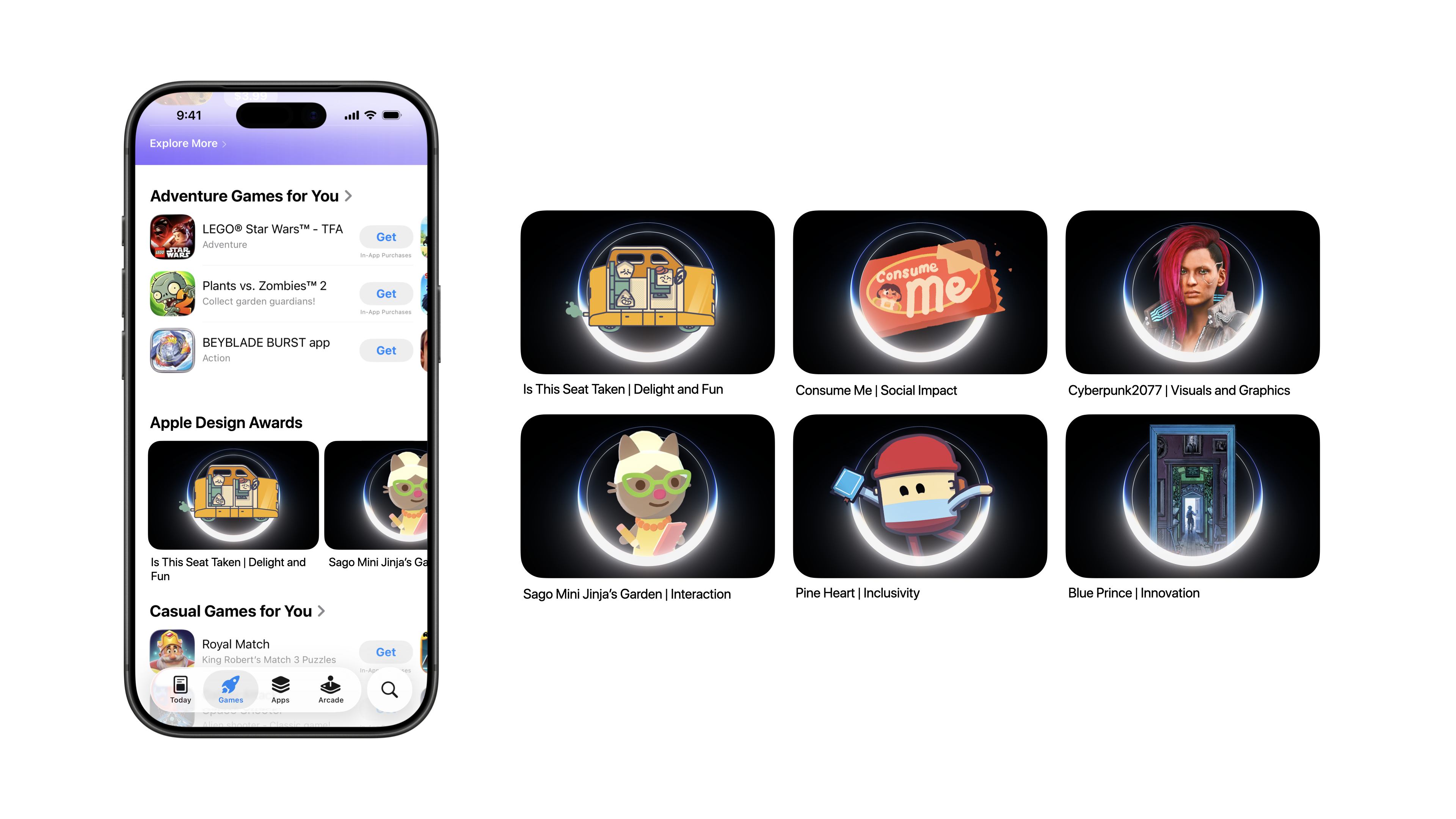
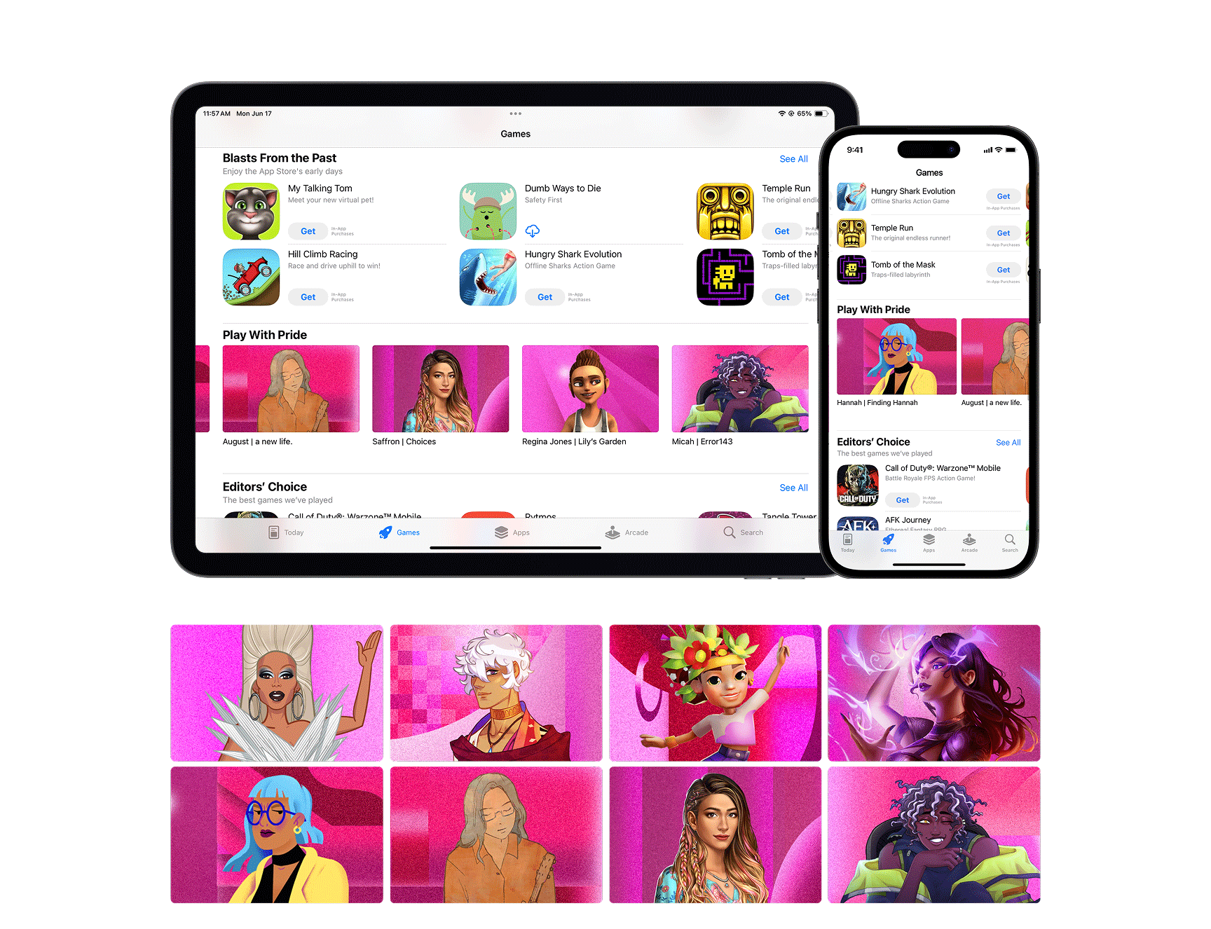
I was tasked with designing a system for a group of games that required weekly updates, business affairs approval, and often extremely low-fidelity assets. Creating a set of essential, flexible elements that could hold up under these constraints was both critical and challenging.
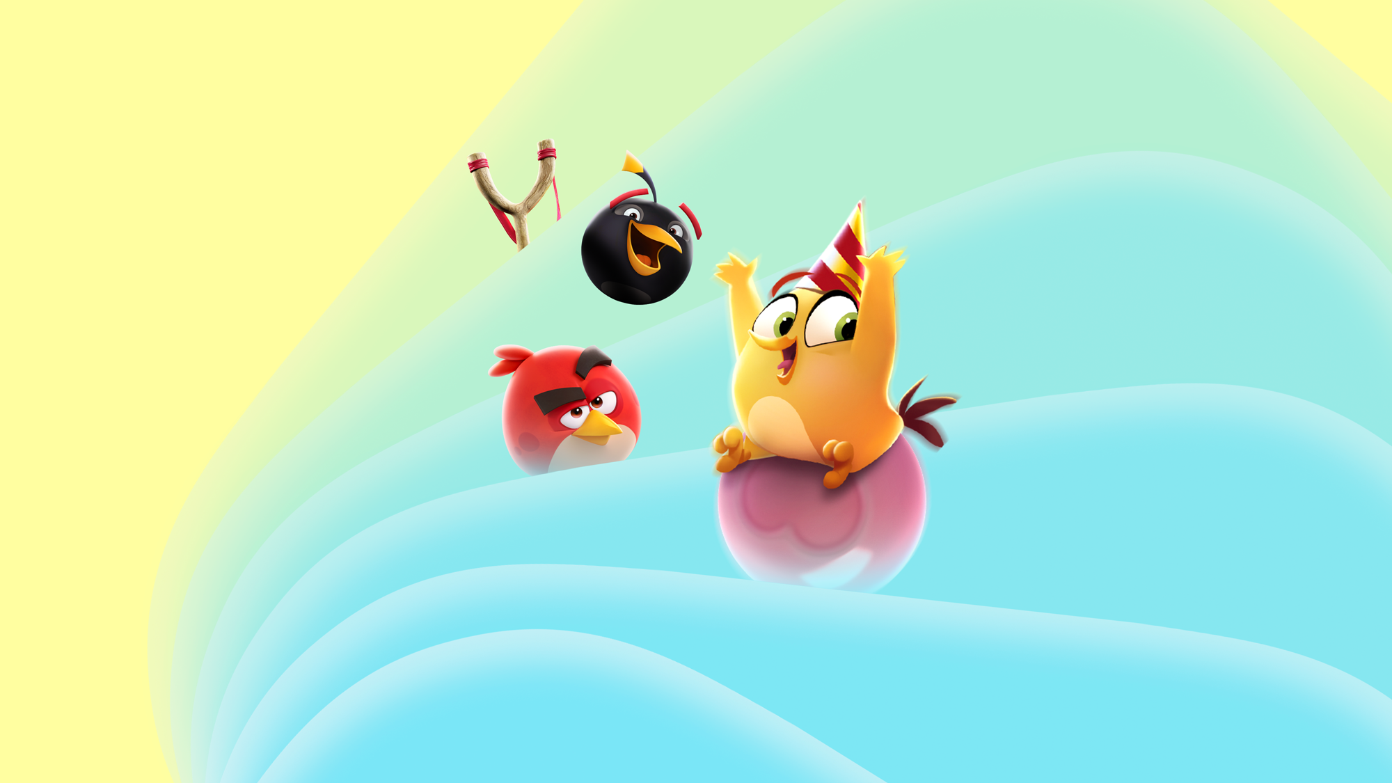
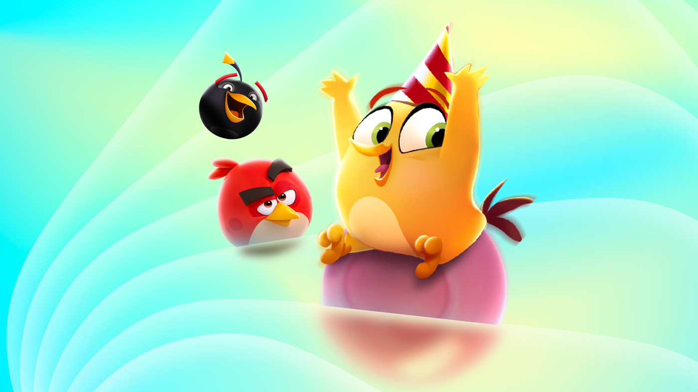
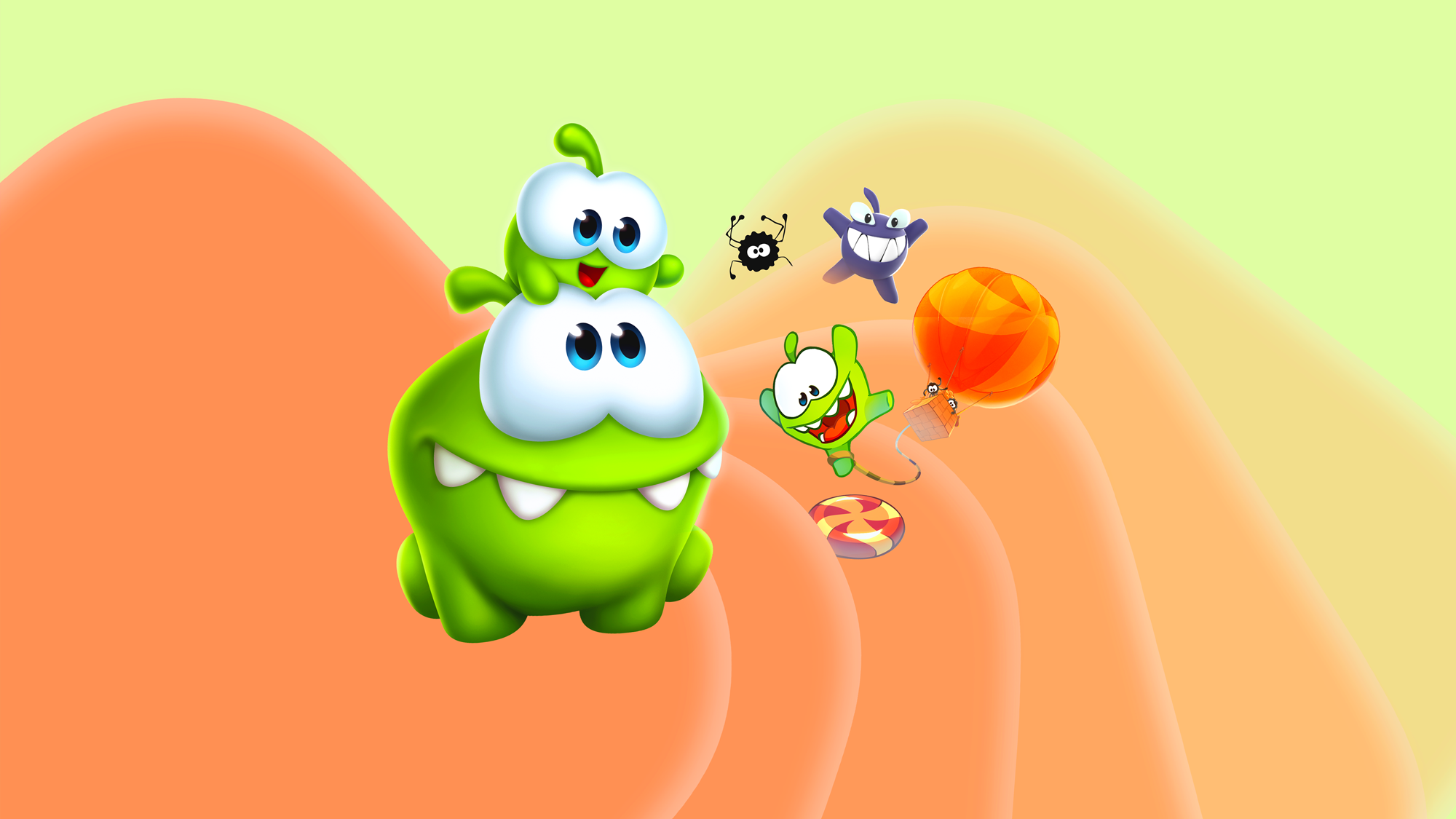
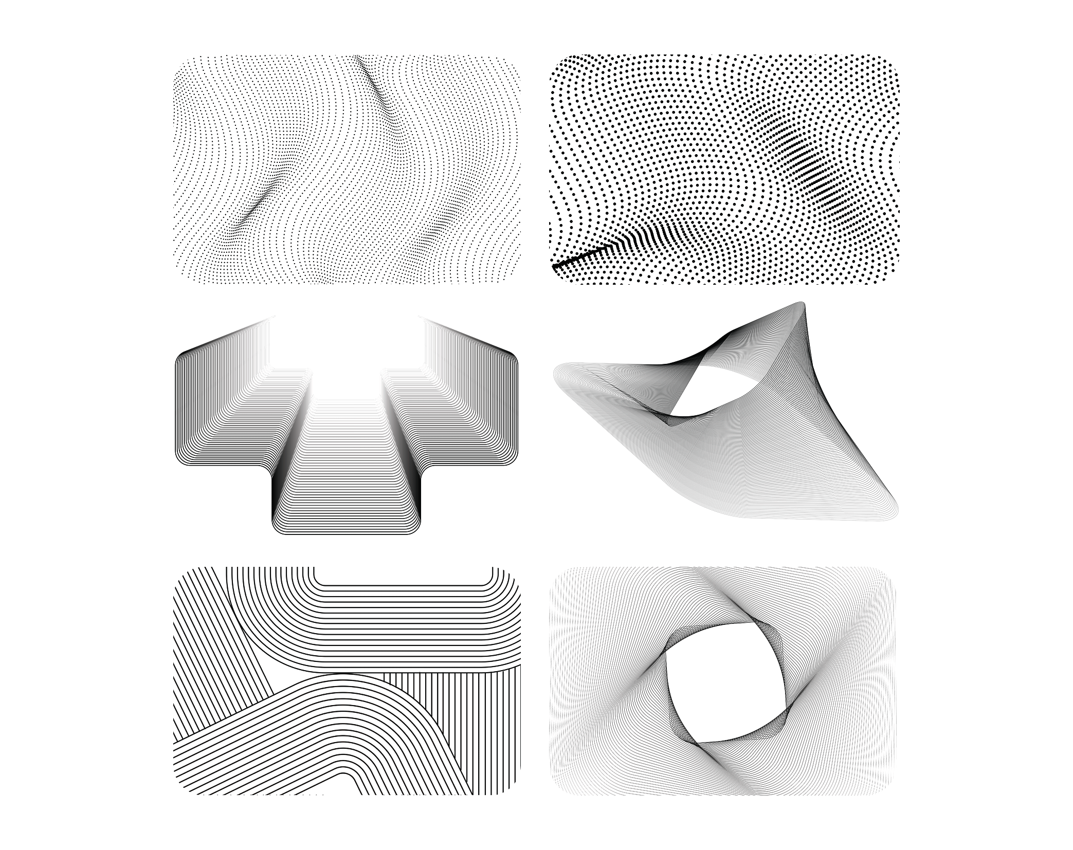
Because the cover art needed a weekly refresh, I explored a mesh pattern as an evergreen foundation, a symbol that feels timeless and generic enough to sit behind ever-changing content without raising approval or licensing issues. After testing several directions, I landed on a center-focused chiclet with line art radiating outward, an approach that speaks to the core spirit of the App Store.

A vibrant color gradient brings it all together, giving the system a playful, fun, and modern feel.

Problem solving | Communication | Production
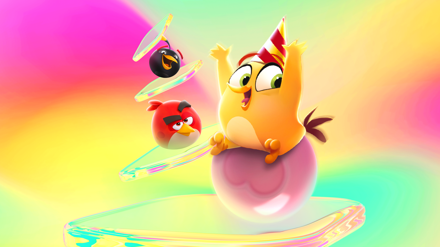
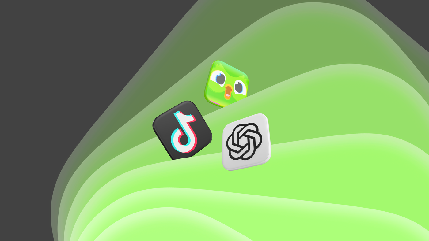
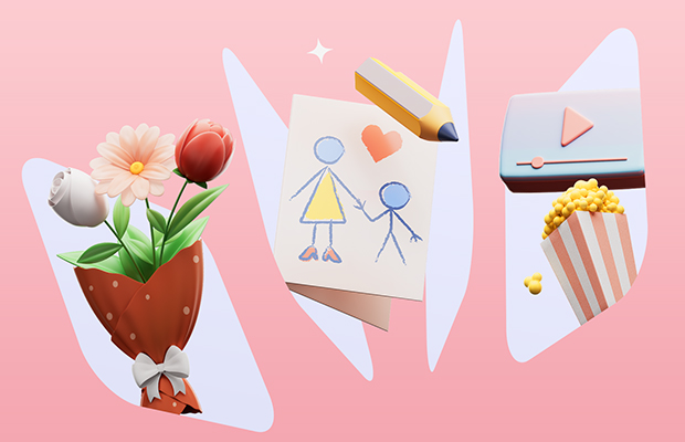
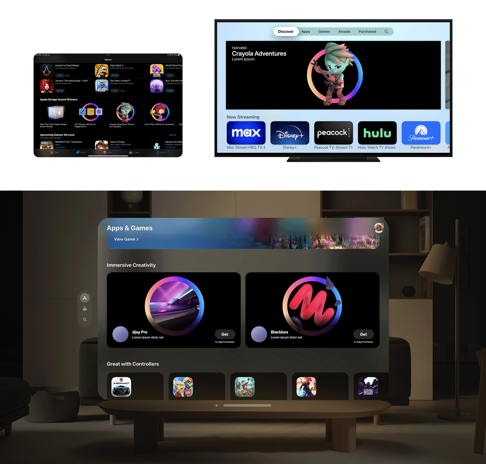
Developer assets for Apps and Games differ significantly in their presentation and purpose. In the realm of games, captivating high-quality character art often takes center stage, effectively presenting the essence of the game. However, when it comes to Apps, the challenge of presentation is more nuanced. Apps encompass a wide range of categories, including language-learning apps, AR experiences, meditation apps, and more. How to implement two different art styles into a harmonious visual consistency—maintaining the charm of each product while ensuring they complement and enhance each other seamlessly—is a challenge I always encounter.

Design a key visual that communicates the app's unique value, and craft a cohesive visual system that strikes the right balance between the captivating appeal of a game character and the less visually appealing nature of an app's user interface. Utilizing screenshots, promotional materials, and conducted research, I identify the essential elements or user interface that best represents the core value of the app. Crafting these assets using vibrant colors, toning down the visual complexity, and building a cohesive visual following the brand guideline—focusing on maintaining visual consistency across all platforms, ensuring uniformity in lighting, color grading, and scale throughout the design.


Composition | Production

Logo Design | Brand identity

Creative concept | Production